Good flag things: high-contrast, bold readable designs.
Bad flag things: colour clash, 'metal on metal' (yellow and white together), use of lettering, clipart-like symbols, flag-in-a-flag, coats of arms, maps.
The reviews regard only the graphic design of the flag, not what I might think of the country.
Afghanistan: overly complex design in the middle, but white on red is good. Classic layout. B
Albania: black on red is good, very striking emblem! Great flag! A
Algeria: Not a fan of the red and green or how the star tangents the bisection. Stars are always cool though. C+
Andorra: clipart-like coat of arms with lettering, bad show! D
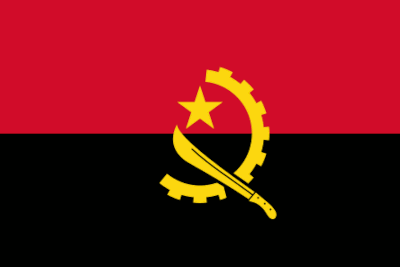
Angola: Nice! Gold on black stands out nicely and shows against the red well too. Simple, readable emblems. A
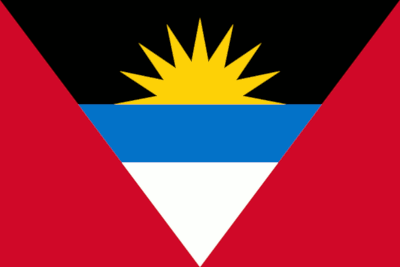
Antigua and Barbuda: Lovely shapes! Let down by the use of that red and blue together. B
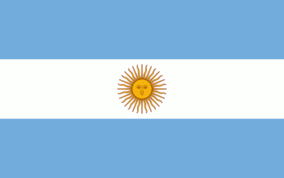
Argentina: Soft palette, but nice. Shame about the clipart-like emblem. B
Armenia: Classic design, sadly unappealing palette. C
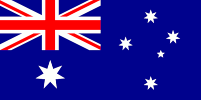
Australia: Cool stars! Let down by having another country's flag in your flag. That's silly. B+
Austria: Classic design + palette. Good! But if you're going to stick to classics you need to be more perfect. A-
Azerbaijan: Lovely emblem with good whitespace around it. Let down by unfortunate colours. B+
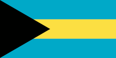
Bahamas: Nice! Good design, pleasant palette. A
Bahrain: Red and white is good but unappealing shapes. B
Bangladesh: Pleasing asymmetry and simplicity. Red and green surprisingly not as clashy as expected. A-
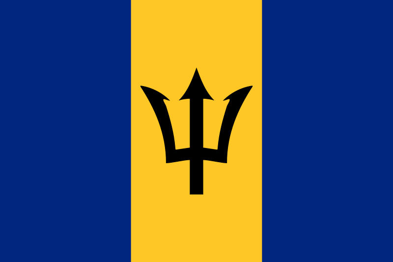
Barbados: Good use of black on gold, not sure it quite goes with that shade of blue. B+
Belarus: That border's pretty but too complex to belong on a flag, and doesn't seem to align with the green bit. C
Belgium: Red, black + gold is such a good palette it deserves something more interesting than a standard tricolour. B
Belize: Entire coat of arms (not just a shield) on flag, with lettering. Bad show. D
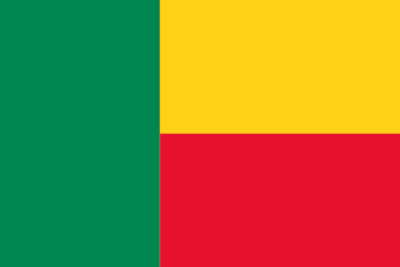
Benin: Nice layout, not sure about that green with that red. A-
Bhutan: Dragon! Love the diagonal layout. But way too much detail for a flag. Its silhouette needs to stand alone. B
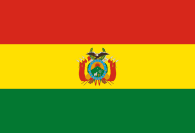
Bolivia: Not only is it a coat of arms, but it's way too small to see. Awful. D-
Bosnia and Herzegovina: Striking truncation on the stars, spoiled by that vertical detracting from the diagonal. A-
Botswana: Pleasant, possibly a little too serene? A-
Brazil: Great shapes, nice stars… let down by use of lettering. B
Brunei: Great palette, but includes lettering and awkward tangents caused by the (overly complex) red design. C
Bulgaria: Red and green is hard to pull off and this flag doesn't really do it, nor has anything to redeem it. C
Burkina Faso: Nice star, nice layout. That red and green though? B+
Burundi: Nice layout and whitespace around the stars, but those green borders on the red stars? Oh dear. B-
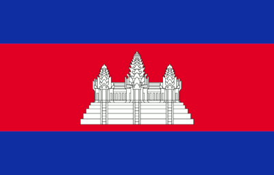
Cambodia: Great layout and white on red is good, but that's too much detail for a flag. B
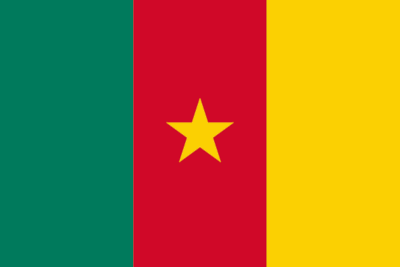
Cameroon: Great star and use of red and gold! Shame about the red with green. A-
Canada: Superb! Striking silhouette, let down by neon shade of red. A
Cape Verde: Has potential, but gold on white is a no-no, as is the awkward slight overlap of stars on red band. C+
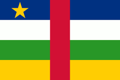
Central African Republic: Good asymmetry, too many colours. B-
Chad: Classic design, but I'm not a fan of red, gold AND blue. B+
Chile: Good layout and it has a star! That's a good flag. A
China: Lovely! Nice red and gold, good use of rotation on the small stars. Great flag. A+
Colombia: Pleasing vertical asymmetry. Nice gold expanse to rest eyes on. Nice flag. A-
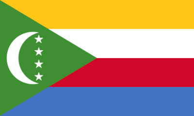
Comoros: Too many colours, and that line of stars means vertical, horizontal and diagonal elements. Too much. C+
Congo: A bold variant on a classic layout! Nice palette with a subdued gold that doesn't clash. Great work! A
Cook Islands: A whole ring of stars! Ace! But it has another country's flag on it. A flag on a flag! That's silly. B-
Costa Rica: Great palette, striking layout. Classic good flag. A
Cote d'Ivoire: Classic layout. Orange is an unusual flag colour choice that can work well but not with this green. B
Croatia: Not one but six shields! A popular tricolour scheme can't redeem this. Bad show. D+
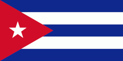
Cuba: Super! Nice palette, nice layout that looks like go-faster stripes, and a star! Good flag. A
Cyprus: Has a map on it. See me after class. F
Czech Republic: Lovely! Great layout and colours. A good flag. A
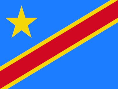
Democratic Republic of the Congo: Nice big star! Good colours, although the stripe is a bit skinny. A-
Denmark: Good asymmetry with a striking colour combo. A
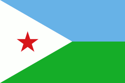
Djibouti: Nice layout with a star (in unusual red!). Bad palette, though. B
Dominica: Oh dear. Too many colours, awkward layout, clipart purple parrot. Bad flag. F
Dominican Republic: Good colours, good layout with nice colour asymmetry. Spoiled by tiny coat of arms. C-
East Timor: Amazing! Really good star, lovely chevrons, super contrasting palette that doesn't clash. Superb flag! A+
Ecuador: Clipart-y coat of arms with tangents and blue mantling on a blue field. Bad job. D
Egypt: Good palette including dark gold that doesn't get lost on white. Let down by clipart + lettering. B-
El Salvador: Terrible. Tiny clipart coat of arms with lettering in gold against white. What a shame. D
Equatorial Guinea: One of the worst examples of clipart. This looks as though it was made in Powerpoint. F
Eritrea: Good layout! Gold emblem stands out nicely. Green and blue could use tweaking. B+
Estonia: Interesting choice of black as the central focus. Classic layout but maybe a little sombre. B
Ethiopia: A wonderful variant on the classic star! Good layout with use of roundel. Let down by that blue. A-
Federated States of Micronesia: Nice stars in an interesting cruciform layout. Would like a bit more contrast. A-
Fiji: Coat of arms, clipart and a flag in a flag. Bad flag. F
Finland: High-contrast palette with pleasing asymmetry. Nice thick lines on the cross. A good flag. A
France: Classic palette + layout. But if you're relying on classics you need to do something more spectacular. B
Gabon: Nice layout, let down by the palette. C
Gambia: Excellent layout with mix of bar heights. But it's hard to pull off 4 colours and this doesn't do it well. B-
Georgia: Cruciforms upon cruciforms! Intriguing fractal design spoiled by neon red. B+
Germany: Classic layout, nice gradation from darkest to lightest. Nice flag. A
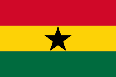
Ghana: Nice use of red with green that doesn't clash. Good star, shame it tangents the edges of the gold bar. A-
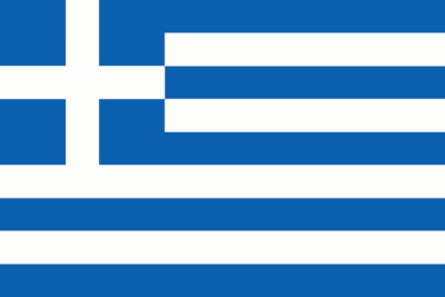
Greece: Blorf. Nice minimalist palette but that countercharging makes the eyes go funny. C
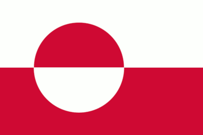
Greenland: Urgh. Nauseating layout and bad shade of pinky-red. C
Grenada: Dare I say too many stars? The red border makes this overly busy and lets this down. C+
Guam: Everything about this design is absolutely atrocious. See me after class. F
Guatemala: Pleasant blue and white, but oh dear, that excessively detailed emblem with lettering. Bad flag. D+
Guinea: Classic design with a cheerful palette, although that green could stand to be warmer. A-
Guinea-Bissau: Lovely black star on red. Good layout and dimensions, spoiled a bit by clashing green. B+
Guyana: Great chevron design. Black and white borders usually would be bad but break this up nicely. A good flag! A
Haiti: Tiny coat of arms, plus looks hastily pasted-on. Bad show. D
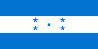
Honduras: Nice palette and layout, but maybe the stars are a little on the small side. A-
Hungary: Lovely wide dimensions. Red and green often don't work but these are nicely desaturated. Good flag. A-
Iceland: A classic Nordic motif with a classic palette. Good work! A-
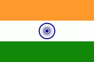
India: Good use of whitespace around the emblem, but a little too complex for a flag. Blue doesn't go with orange. B-
Indonesia: Superb simplicity, and red and white is hard to do badly with. Good flag. A
Iran: The bar borders are almost too complex but are super lovely. Bold emblem in the middle. A good flag! A-
Iraq: Nice use of red, white and black. Let down by use of lettering and green. B-
Ireland: Oddly wide dimensions to pair with a vertical tricolour. Nice warm green to go with the orange. B-
Israel: Great emblem and whitespace, blue could stand to be a little less saturated. A nice flag. A-
Italy: Very good shade of red; bright without being neon. Classic layout. Good flag that pulls off red with green. A-
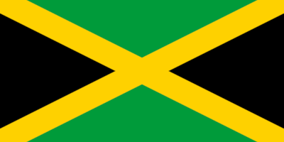
Jamaica: Fantastic! Black and gold work well, and the saltire design is lovely. A very good flag! A+
Japan: Very good simplicity with pleasing dimensions. A lovely flag. A+
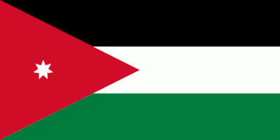
Jordan: Great layout. Nice star shape, let down by the star looking a bit tiny and lost. B+
Kazakhstan: Nice blue with gold, but too many complex motifs with different styles. Bad show. C-
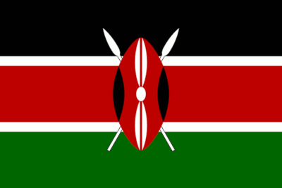
Kenya: Brilliant! Cleverly straddles border between complexity and simplicity. Black flaunches line up with red bar. A+
Kiribati: Oh dear. Too clipart-like, and not enough space given to the sun and bird. D+
Kosovo: Don't put maps on your flags. See me after class. F
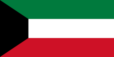
Kuwait: Interesting use of a trapezium. A good modern layout with decent palette. A-
Kyrgyzstan: Good red and gold. Almost too complex for a flag, but just allowable. A-
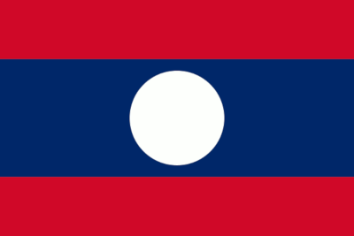
Laos: Great layout. The roundel has pleasing simplicity and interesting use of white. A good flag. A
Latvia: Nice layout, let down by this odd liver colour. B-
Lebanon: Awful melting tree that tangents the red bars. Oh dear. D
Lesotho: Good use of black on white for the emblem. That shade of blue lets this flag down. B
Liberia: Very good star. Rather too many stripes. B-
Libya: Fantastic star and crescent, and white on black is a great choice. Red could do with tweaking. A good flag. A-
Liechtenstein: The clipart crown lets this down. The silhouette should stand on its own merit. C
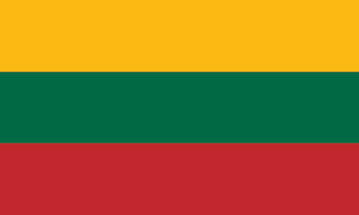
Lithuania: Dimensions and layout work together very well. Palette is a little unappetising. B
Luxembourg: Lovely bright shade of blue, and a pleasing layout. A good flag! A
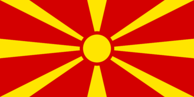
Macedonia: Fantastic! Good red and gold with a very striking yet simple layout. A super flag! A+
Madagascar: Dimensions go very well with this layout! But what's with this shade of orangey-red? Oh dear. C+
Malawi: Interesting non-centre position for the emblem, and good use of red and black. Shame about the green. B+
Malaysia: A lovely star and crescent! Otherwise spoiled by too many stripes. B
Maldives: A pleasing crescent, but the huge red border really lets this flag down. D
Mali: A classic design, let down by the use of that neon green. B
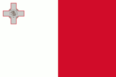
Malta: A pleasingly simple flag let down by the tiny clipart cross (with lettering, oh dear) lost in the corner. D+
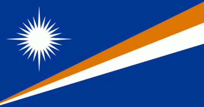
Marshall Islands: An interesting design let down by elaborate star and looking unfortunately like airline livery. C
Mauritania: A bold and simple design with an interesting use of gold on green. Also looks a bit smiley! Good flag. B+
Mauritius: Too many colours. An attempt at varying the classic tricolour that ulimately fails. C-
Mexico: A nice tricolour spoiled by far, far too complex an emblem. C-
Moldova: Overly bold primary coloured tricolour with a clipart-y coat of arms. Bad show. D
Monaco: Great simplicity of design and palette. Unfortunately with less pleasing dimensions than Indonesia. B+
Mongolia: Lovely gold emblem, possibly more complex than necessary but very clear. A good flag! A-
Montenegro: Oddly skinny gold border with much too complex an emblem. Oh dear. D+
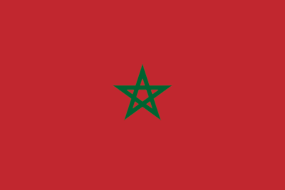
Morocco: A nice variant of the classic star, let down by looking a bit lost and by the palette. B-
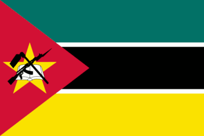
Mozambique: Good: nice teal, gold star. Bad: trying to cram in too many clipart-like emblems. Dear oh dear. C+
Myanmar: Great! What a nice big star! A very cheerful and nice flag. A-
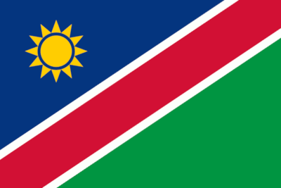
Namibia: Nice sun emblem. A good attempt with the layout that ultimately fails to be striking. B-
Nauru: Odd dimensions on almost every aspect of this, plus a tangent with the bar and star. B
Nepal: Trying to be far too clever for its own good. See me after class. D
Netherlands: Good dimensions for this layout, plus a classic palette. A good flag! B+
New Zealand: Some nice little stars, let down by unattractive white borders and by flag-in-a-flag. C
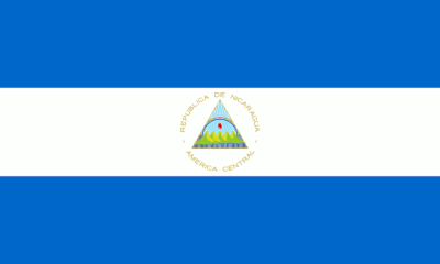
Nicaragua: Overly complex emblem, plus lettering in gold on white. Bad show. D
Niger: Great layout, lovely orange roundel! Cute squat dimensions. A nice flag! A-
Nigeria: Oddly oblate dimensions for this layout. Otherwise nicely clear and simple. B-
North Korea: Nice use of star and roundel. Good layout with nice asymmetry on the emblem placement. A good flag! A
Norway: A classic Nordic motif. but the red is possibly too bright. A good flag. B+
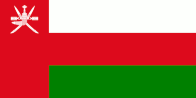
Oman: The use of red breaks this layout up oddly, and the complex emblem further lets this down. D+
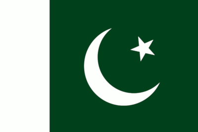
Pakistan: A lovely big emblem with a nice dark background to make it stand out. What a good flag! A
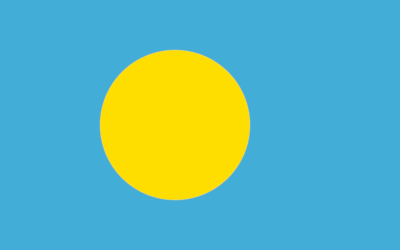
Palau: What a cute flag! This is pleasingly simple and has a cheery palette. Good job! A
Palestine: Nice layout, but the oblate dimensions make that red wedge want to extend further. A good flag. B+
Panama: Interesting use of rotational symmetry, but breaking up by quadrants rarely works. B-
Papua New Guinea: Great! Good palette, diagonal layout. Bird is almost too complex but allowable. A good flag! A-
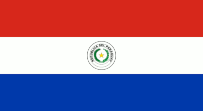
Paraguay: Clipart emblem with lettering. Bad show. D
Peru: Great! Very bold and simple, with good red and white. A good flag! A
Philippines: Nice layout with a nice emblem, let down by the use of gold on white. B-
Poland: A beautifully simple design let down by a nauseating shade of cherry red. B-
Portugal: Clipart on clipart! Searing, neon shade of red. Bad show. D-
Qatar: Very oblate ribbon-y dimensions, fussy border and a red-purple that doesn't know what colour it wants to be. D
Romania: A classic layout let down by overly bright colours, each one competing for attention. Also Chad and Romania really need to sort out their identical flags. B+
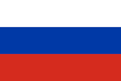
Russia: Good dimensions for this layout, but that red is too orange and the blue too bright. B-
Rwanda: A lovely design! Nice emblem placement and palette that works well to not clash. A good flag! A
Saint Kitts and Nevis: This would normally be too many colours, but it works here. A good flag! B+
Saint Lucia: A nice combination of chevrons but looks a bit lost in the middle. B-
Saint Vincent & the Grenadines: A bad palette and an emblem that looks too much like a logo. Dear me. C-
Samoa: Good stars, but so tiny and isolated they look menaced by all that red. C
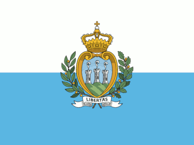
San Marino: Don't put your coat of arms on your flag, lads. Bad show. D
Sao Tome and Principe: A nice layout, though dimensions perhaps a little oblate. Nice stars, green a bit neon. B-
Saudi Arabia: Lettering on flag. Bad show. That's a nice green, though. C-
Senegal: Nice and simple, with a good star. A good flag! B
Serbia: Clipart shield and crown. Oh dear. A shame, because that's a nice red and blue. D+
Seychelles: Brilliant design! But too many colours. C+
Sierra Leone: Good layout and dimensions, let down by two colours competing for a focal point. B-
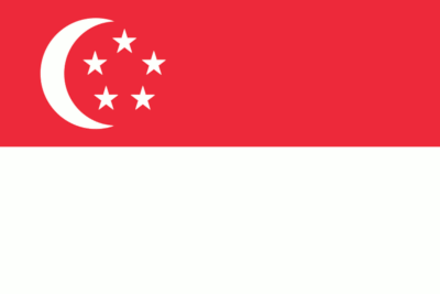
Singapore: Lovely pentagon arrangement with the stars! A great layout let down by the shade of red. B+
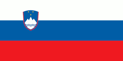
Slovakia: Shield on flag. Bad show. Looks more like sports club livery than a national flag. C-
Slovenia: Shield on flag, with the added bonus of it being tiny and unreadable. Bad show. D
Solomon Islands: The stars are packed in together and appear crowded in by the green. Let the stars breathe. C+
Somalia: A nice big star! Periwinkle blue is possibly too soft for a national flag. But cute. B+
South Africa: An attractive layout but frankly too many colours. Four is hard to work with. This is six. C+
South Korea: Very striking! Black emblems on white field are lovely. Not sure about blend of curves + straights. B
South Sudan: Good angle for the star, but that blue doesn't help anything. C
Spain: Ruined by the clipart coat of arms. Would have been excellent otherwise. D
Sri Lanka: A mess. Looks like two flags next to each other, and has a clipart lion. See me after class. D-
Sudan: A good layout with good dimensions. Red and green are so hard to get right, and this doesn't. C+
Suriname: Good use of white bars to prevent red + green clash. Star could stand a little more whitespace. B
Swaziland: Clipart, and an awkward shade of blue. Bad show. D
Sweden: Uncommon blue + gold usage, and very nice and simple. A good flag! A
Switzerland: Nonstandard dimensions are hard to pull off, but this goes with the emblem nicely. Valiant effort. B
Syria: Red, white and black is great, and this is a good layout. Green is a curious star colour choice. B-
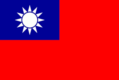
Taiwan: An attractive emblem, but crowded in by that expanse of neon red. C
Tajikistan: A nice layout but gold on white is hard to get right. This doesn't. C
Tanzania: A good layout but the green and blue could stand tweaking to avoid so many competing colours. B-
Thailand: A great layout, slightly let down by a very bright red. B
Togo: A lovely star! But a bad palette lets this down, as well as the bottom two stripes feeling unnecessary. C+
Tonga: A nice cruciform emblem, but a huge expanse of red makes it feel crowded in. B-
Trinidad & Tobago: Great! A lovely uncommon black stripe, in a striking black, white and red palette. A good flag! A
Tunisia: Lovely! Good use of a roundel and emblem, in red and white. A good flag! A+
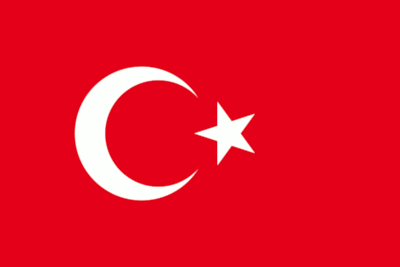
Turkey: Super good emblem! Nice and big, in striking red and white. A great flag! A+
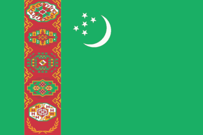
Turkmenistan: Massively complex motif, with odd emblem placement and unpleasant shade of green. A bad flag. F
Tuvalu: An unpleasant blue, and flag-in-a-flag. Bad show. D-
Uganda: A clipart emblem with odd roundel placement and too many stripes. Bad show. D
Ukraine: Nice simplicity in design and palette. A good flag! B
United Arab Emirates: A good layout for these dimensions, let down by clashing red and green. C
United Kingdom: Overly fussy and has weird radial symmetry. Trying to do too much. D
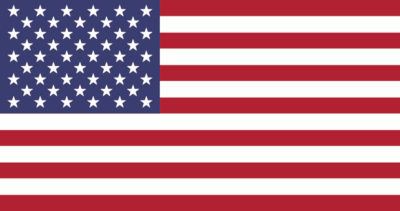
United States: Stars are cool. That's too many stars, lads. It's too many. That's too many stripes. Too many. D
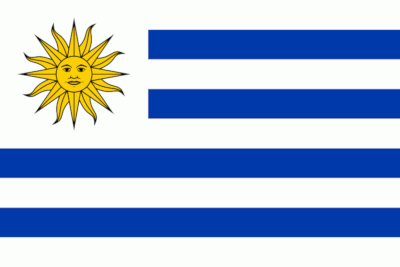
Uruguay: Too many stripes, check. Clipart emblem, check. And I don't like how that sun is looking at me. D
Uzbekistan: Let down by the skinny red stripes, the neon green and the stars probably insulting me in morse code. D
Vanuatu: Lovely gold on black! Emblem slightly fussy. An okay flag. B-
Vatican City: Clipart emblem, and white right next to neon gold. Cute square layout, but otherwise bad show. C-
Venezuela: A nice curve of stars, but looks a bit like a sadface. Plenty of room for improvement. C
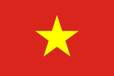
Vietnam: Great! A simple no-nonsense layout with a lovely big star. A great flag! A+
Yemen: A classic layout with one of the best palettes. A good flag! A
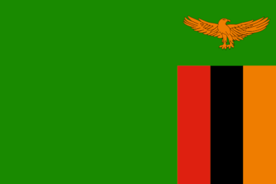
Zambia: Nice unconventional use of orange with black, let down by clipart emblem and huge expanse of green. C-
Zimbabwe: Clipart emblem obscuring a star (itself with a bad clipart shape), and too many colours. Bad show. D